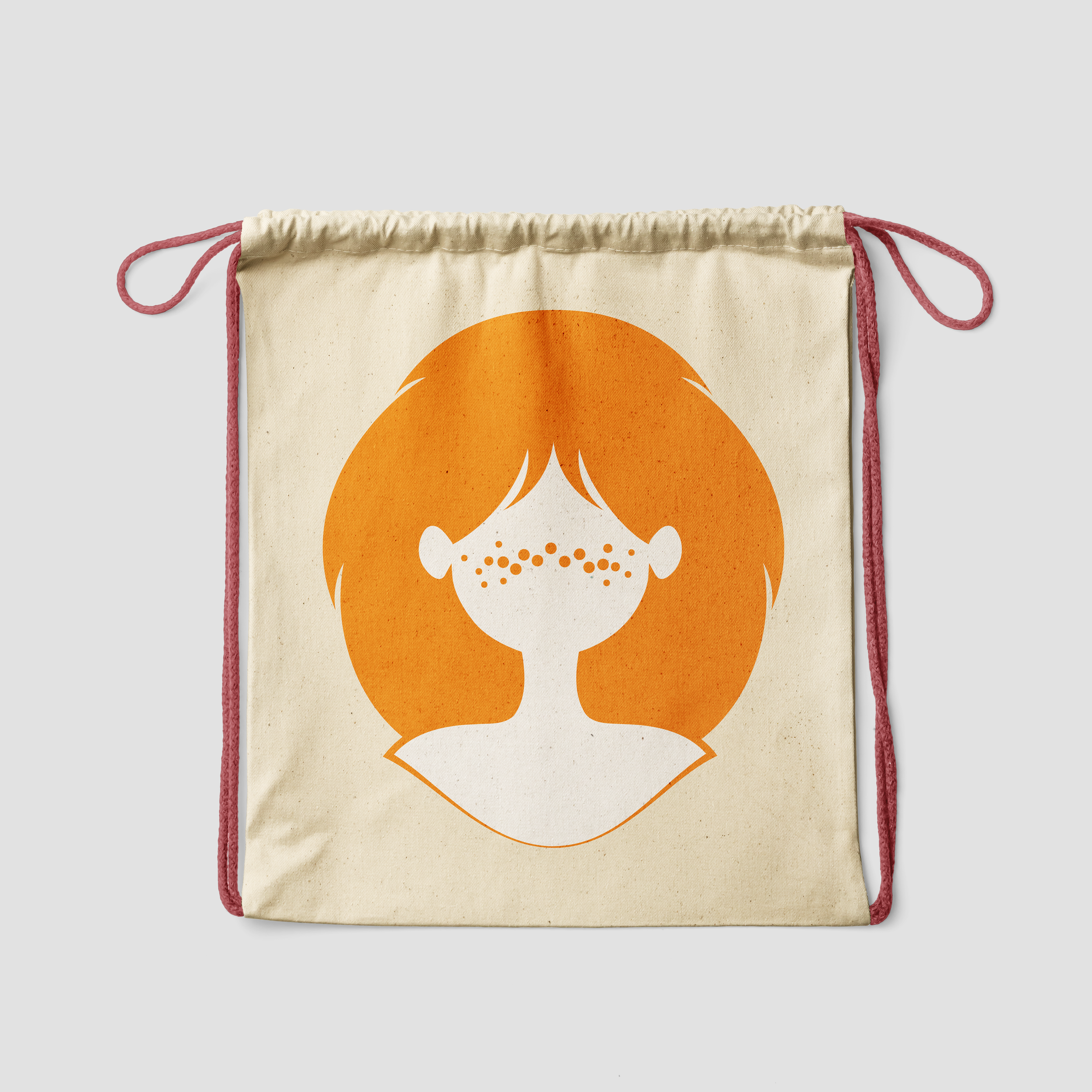
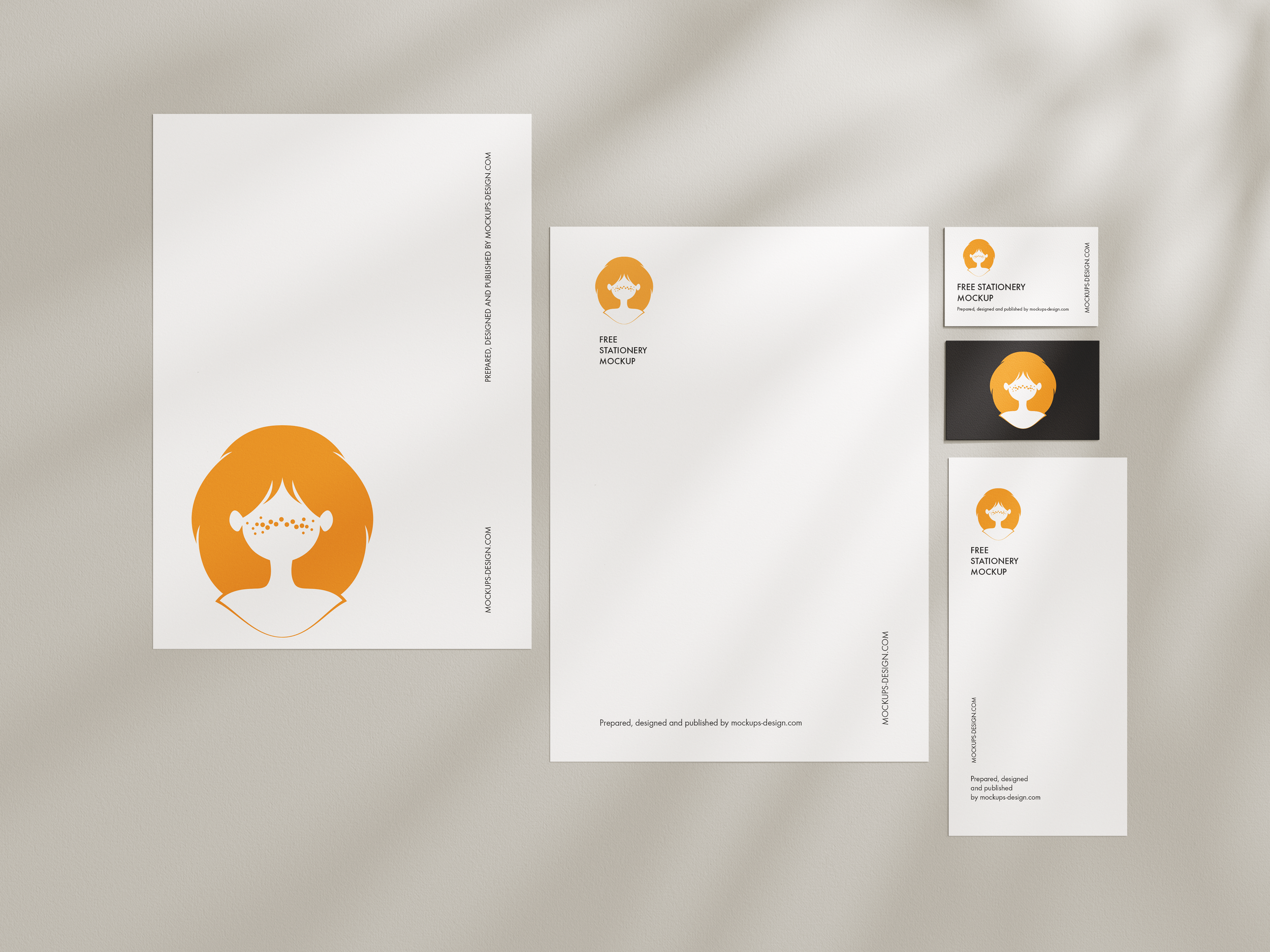
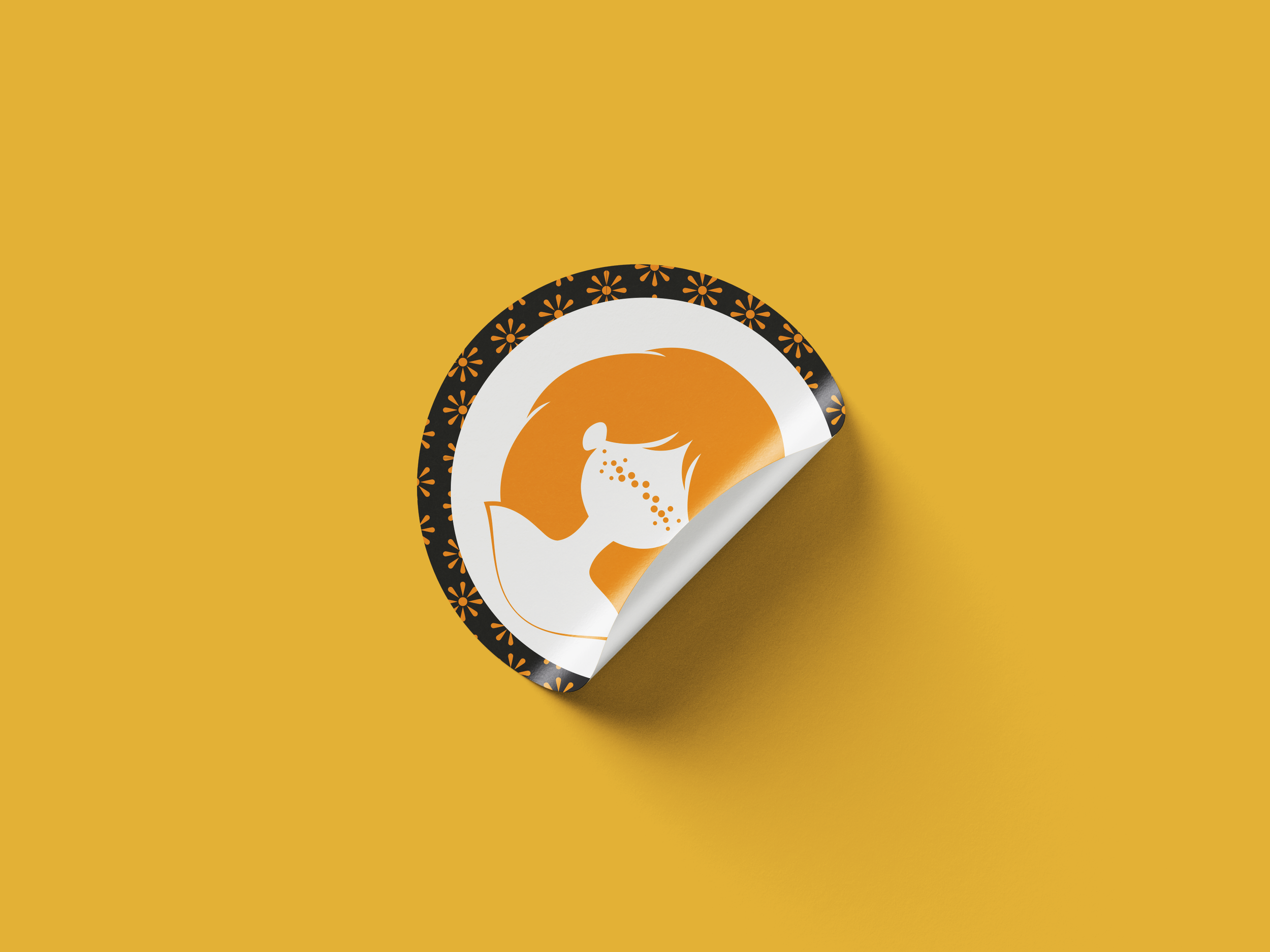
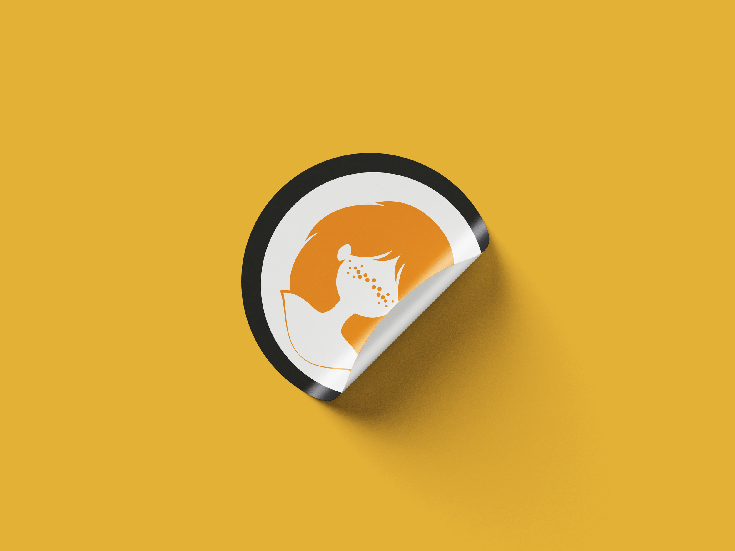
A full rebrand of the Redhead Days, the world’s largest and longest-running festival for natural redheads. Held annually in Tilburg and attracting thousands of visitors and volunteers from over 80 countries, the event is a vibrant celebration of identity and community. The new visual identity was developed in collaboration with lead designer Lindy Overdiek, with a focus on bold color, inclusivity, and simplification.
A fresh take on the Redhead Days visual identity


As the existing logo and branding began to feel dated, the Redhead Days team sought a bolder, more streamlined identity to improve brand recognition and reduce production costs — especially for merchandise, where the original multi-colored logo had become expensive to reproduce.
Redesigning the identity while staying true to Redhead Days’ core values was a challenge. With a long-running annual event and a global audience, there was little room to reinvent without losing brand recognition.
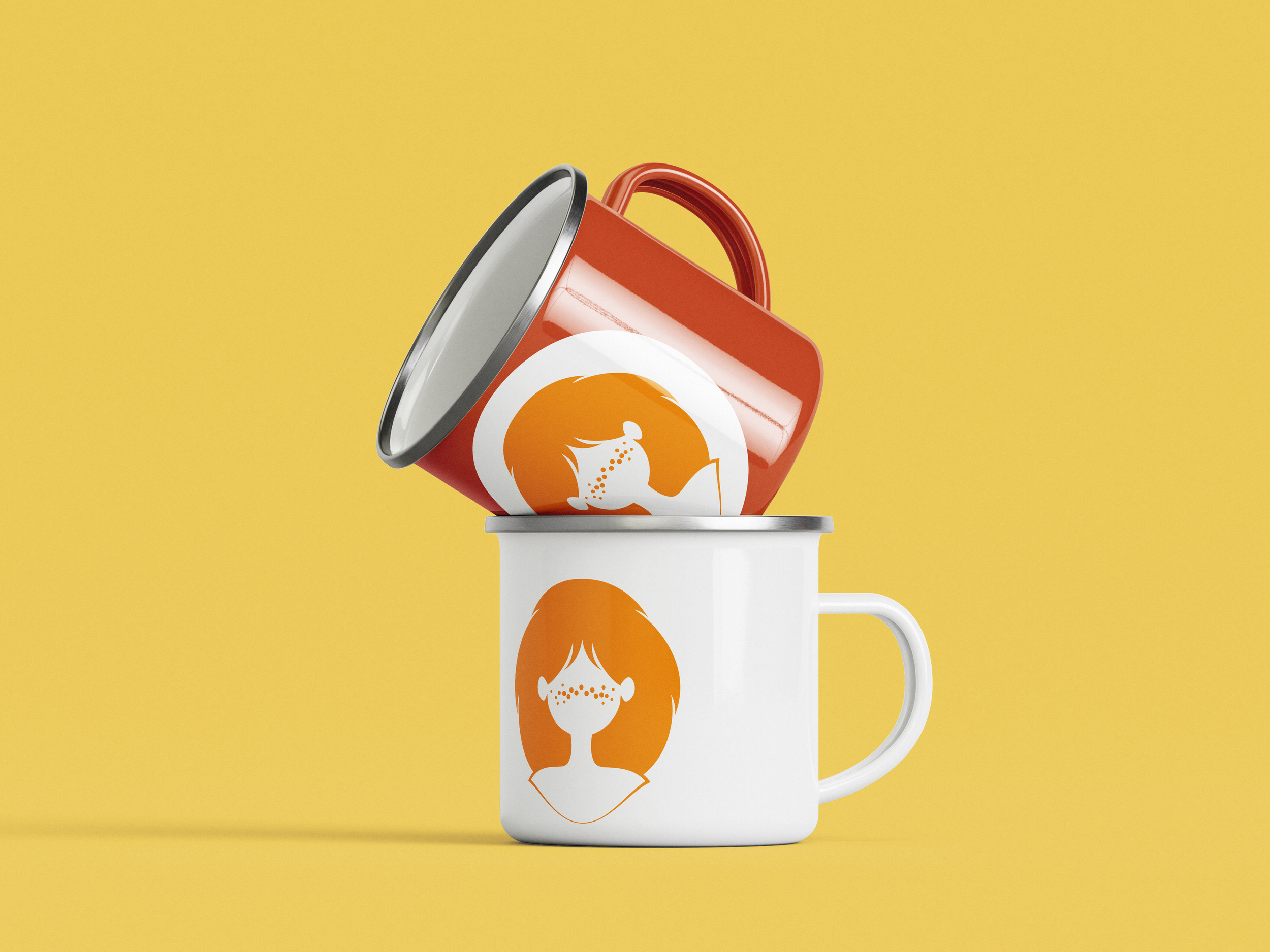
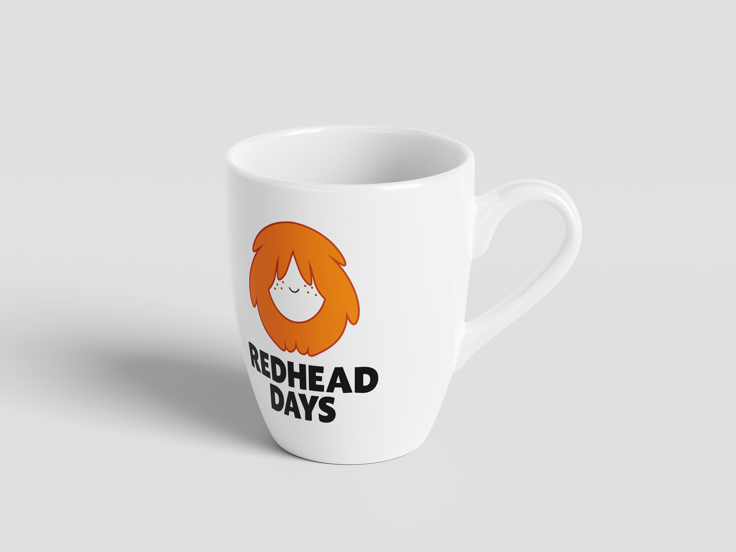
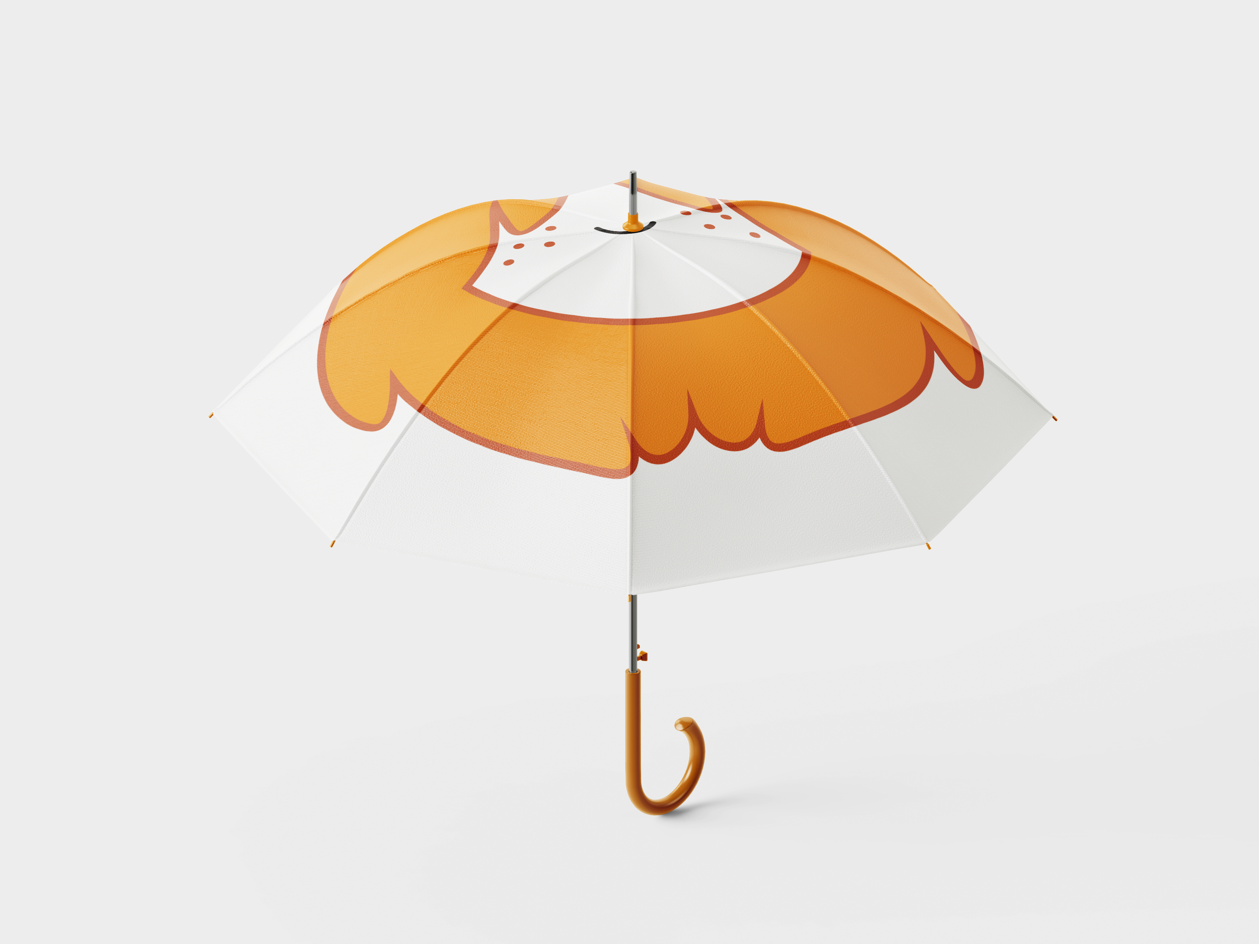
The solution: keep the iconic silhouette, but update the facial elements to better reflect the broader community. The color palette was also reduced to a single, versatile tone for clarity and cost-efficiency.
Assignment Overview

Visual Identity Manual
The Redhead Days is largely run by volunteers, with teams changing from year to year. Not all of the volunteers are professional, but perhaps more importantly, none of them are initially familiar with the inner workings of the Redhead Days brand.
To support the communications and design teams, we created a concise, easy-to-use brand manual. The manual outlines the visual identity and how to apply it, essential for a team with high turnover and limited onboarding time.

For a full overview of the mockups and an earlier iteration of the design, take a look at the gallery below. If you have the chance, go take a look at the Redhead Days too. It really is spectacular!


Let’s Chat!
e-mail: thijme.van.arendonk@gmail.com
phone: +31643690276